What I’ve learned from three years as a data scientist [498 words]

It’s been a while since I’ve written anything in this blog. I’ll admit that I started it back in 2020 as a tool to help get me interviews for Data Scientist roles. And it worked. But now I’ve been working as a Data Scientist for long enough to share my thoughts on the industry, and to use this and other forums to contemplate what the future holds and to clarify some positive steps towards it.

Since 2021, I’ve been working as a Data Scientist: briefly at Coefficient, and then at BT Group, before my current role as as Senior Data Scientist at HM Land Registry. So over the past three years, I’ve been fortunate to gain fairly varied data science experience. Add to this my previous experience – in climate finance, policy research and writing, and development economics (not to mention stints as a wine maker, sommelier, and teacher) – and I have a fair bit to share.

I worked with the Consumer arm of BT Group to personalise the experience enjoyed by each customer across their range of interactions with the company. This spanned both BT and EE brands across both mobile and broadband. My work pushed beyond the traditional marketing applications of machine learning – like churn and propensity models – with innovative new techniques for: profiling customers with Nonlinear Dimensionality Reduction and Clustering; and predicting the next best action of customer facing apps, websites, and communications using Reinforcement Learning (RL).

At HM Land Registry, my work to date has spanned two areas: developing our Machine Learning Operations (ML Ops) platform; and data extraction from printed documents using Computer Vision (CV), Optical Character Recognition (OCR), and Natural Language Processing (NLP). Currently, I’m leveraging Retrieval Augmented Generation (RAG) to create an internal Large Language Model (LLM) that provides human like responses to internal queries on Practice Guidance.

There are some key difference between these two experiences, crucially: at BT Group, I was focused on structured data generally stored in relational databases, and thus on a toolset of more traditional machine learning tools; while at HM Land Registry I’m focused on unstructured data like images and text, and thus depend more on frameworks built on deep learning foundations.

But there are a few factors in common which may not be immediately obvious to anybody looking from the outside, and which may be useful to keep in mind when considering a Data Scientist role in a large organisation:

  • While machine learning technology accelerates ever faster, there are ever more risks requiring large organisations to develop policies by committee, so change can be gradual;
  • But decisions can also be made suddenly, so don’t lose heart and imagine you’re stuck in a bureaucratic rut forever;
  • Machine learning frameworks and software stacks are somewhat interchangeable, so get started with whatever interests you, and document your key findings and revelations as you go; and
  • Even more than other professional fields, data science is about learning by doing, so dive right into whatever interests you and start experimenting.

Battle Knights ASCII Art Game [490 words]

For a recent interview, my take home challenge was to build a Python program which would output the state of Battle Knights: a simple game involving four knights and four items in a space resembling a chess board. The knights move around the board, find and hold items depending on their values, and win or lose fights depending on the attributes of their items and their role in the fight. The program had to take a text file as output, and output the final game state in the JSON format (see full details in these rules). This all seemed fairly straightforward to me, so I decided to animate the game in the command line using ASCII art as well.

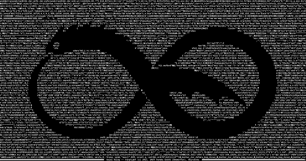
ASCII art is incredible. It draws on the 95 printable characters in the ASCII Standard to create graphic art. Dating back to 1963, these characters allow for creative graphic representation that predates modern computer graphics, and are available for us in all sorts of computing environments – sometimes even hidden in plain sight, as in the comments of web pages’ HTML. If you’ve always thought of code as just the means to an end, instead of an intrinsically beautiful art form in itself, this is just the tip of the iceberg. You can learn a lot from this fantastic presentation by Dylan Beattie, for a start: he performs a song with lyrics that write FizzBuzz in Rockstar (a language he wrote which takes clichéd lyrics from 1980s power ballads as expressions), and a melody that writes FizzBuzz in Sonic Pi (a language written by Sam Aaron that generates music using coding logic and the mathematical representation of sound); he also discusses such marvels as the Quine Relay (see below) – an astonishing feat of software engineering for us to explore another day.

thumbnail.png

My Battle Knights program includes the following files (available on GitHub for you to play with – let me know your thoughts):

  • run.py: Running this file will illustrate the game, as in the GIF above, and output the final game state in command line and as a JSON file.
  • setup.py: Defines classes for knights and items, and creates each knight and item as instances of these classes.
  • states.py: Creates templates for the board state – as illustrated in the animation – and game state in JSON format.
  • art.py: The fun part – some ASCII art that I made for each different game action.
  • move_details.py: Using the move list text file, this determines the resulting outcomes – how a knight should move, interact with items, and fight.
  • process.py: Uses move details to illustrate the board state and ASCII art for each move, and also defines a welcome function to illustrate the start of the game.

I like to keep my posts short, so that’s all for today. If there’s an audience for such obscurities, I’ll come back to this topic in a future post, perhaps with a detailed tutorial. Let me know what interests you most in the comments.

Le Wagon Demo Day [493 words]

Over the past week, we’ve capped off Le Wagon’s bootcamp with the crucially important career week – polishing our professional profiles, planning our next steps, and absorbing much sage advice from tech business leaders and recruitment insiders. But the development of our new data science skillset came to a climax the previous week, as we delivered the projects that we had developed from concepts to viable Machine Learning and Deep Learning apps in less than two weeks.

Image for post

My team developed PlantBase, a plant identification app using Deep Learning to identify plants based on photographs of their flowers (you can find PlantBase on GitHub here). This required Convolutional Neural Networks (CNNs), which we implemented through TensorFlow, with our code written in Python. As expected, the VGG16 model performed best (we also experimented with alternatives including EfficientNet, ResNet, and simpler CNNs built up from their component layers). After a lot of revision and parameter adjustment, we achieved on a model that could differentiate 16 genera of plants using pictures of their flowers, predicting the result with 61% accuracy or predicting the top three results with 86% accuracy.

Image for post

We integrated plant care information, scraped from the Royal Horticultural Society website using BeautifulSoup – this information is shown to the app user when they confirm that their plant has been predicted correctly. We also used the MetaWeather API (application programming interface) to integrate a 5 day weather forecast for London (where the team was based), which is updates whenever the app is used and includes warnings for extreme weather (e.g. frost days, heat waves, gale force winds, or heavy rain).

Image for post

Our team of four completed this app within ten working days, and while we created a viable concept, a lot could be improved with more time. With more experimentation – and potentially more computing power – we could extend our scope to a wider range of plant genera, as well as classifying plants more specifically. One way to achieve this may be to nest multiple layers of CNN models, triggered by each respective layer of classification. We could also extend the weather API to include other cities and towns selected by the user, or use their device’s location data to automate their weather forecast.

Image for post

The other teams in Le Wagon’s Batch #475 also presented some great projects:

  • FiveStar explored AirBnB listings in London, and how a property’s attributes can predict a host’s review score.
  • London Emotions aimed to generate a real time interactive map showing London with emotion ratings of different areas, based on Natural Language Processing (NLP).
  • Fight against FakeNews used NLP to analyse news stories and determine whether they are real or fake.
  • Green Mood TrackR used NLP to understand public sentiment toward energy transition through classification of tweets’ polarity in the United States and the United Kingdom.

My experience at Le Wagon has exceeded my high expectations, and while the whole course deepened my passion for data science, the project weeks really inspired me to build exciting tech – watch this space for more.

Testing the waters [377 words]

After three weeks at Le Wagon’s Data Science Bootcamp, I’ve learnt a lot: about Python and its data science packages (notably numpy, pandas, matplotlib, and seaborn); about SQL and its subtly awesome power; about processing and communicating thoughts with Jupyter’s Notebook and Lab; and about some novel maths and stats that have helped clear away the cobwebs of theory which I haven’t been able to focus on for years.

The end of the third week was a small milestone, with the class presenting on some of their own work for the first time. We had carried out analysis on the Brazilian E-Commerce company Olist, which had made a selection of its data freely available on Kaggle. I can really recommend Kaggle as a place for the aspiring data professional to research and experiment – even just to test the waters, by seeing what sorts of problems need data solutions, and what approaches people are taking and sharing towards realising these solutions. Our brief was to present a case to the CEO of Olist, on whether they should remove some sellers from their list, in order to improve the profitability and reputation of the business.

Basically, my conclusion was that profits could be improved by 25%, by removing removing sellers representing 40% of total sales. The graph above shows cumulative profit per seller, ordered by each sellers profitability, once the implicit effects of negative reviews are accounted for  – clearly indicating that some underperforming sellers were leading to substantial losses in profit. The graph below plots total IT costs against sellers, showing that reduced IT costs can result in a further 9% increase in profits once these sellers are removed, despite the cost effectiveness of established IT infrastructure through economies of scale.

I really love working with code every day, but realise it can be quite opaque and intimidating if you haven’t gotten used to it. So I threw in some graphs this time, and in future posts will start getting into the code while keeping things engaging. Every day at the bootcamp is a new adventure, and I’m excited for what is promised in the weeks ahead – described using trendy and mysterious terms like Machine Learning, Deep Learning, and Neural Networks. I look forward to having you on this journey with me.